The Chicago Athenaeum Museum
Visual Identity
2022
Type of client: Museum–Organization
Type of work: Visual Identity
The Chicago Athenaeum Museum of Architecture Art and Design is an Organization that owns and organizes some of the most important architecture and design awards in the world. With a core program the famous Good Design award (perhaps the longest running good design award program in the world) every year presents and rewards the most daring and modern products and architectural projects. Some more of the awards it organizes are the International Architecture Awards, the American Architecture Awards, the Green Good Design Sustainability Awards, the Europe 40 under 40 Design Awards, Prize Designs for modern furniture + lightning Awards, etc. At the same time, Museum organizes exhibitions all over the world that present the winners of the awards, but also through the Metropolitan Arts Press he organizes and publishes a series of books related to design and architecture.
Its main mission is to archive and record the trends in architecture and design, but also to highlight daring designers and architects, not from the point of view of commercialism, but mainly from the point of view of the progress and influence of the designer and the product or architecture on man and extension to society.With a wide range of actions, a communication system was needed that could work for the Organization’s communication. A Design Alphabet that covers communicatively the high frequency and repetition of announcements in relation to awards, exhibitions and publications. As an office, we were called to meet this need by creating the visual identity of the Organization.
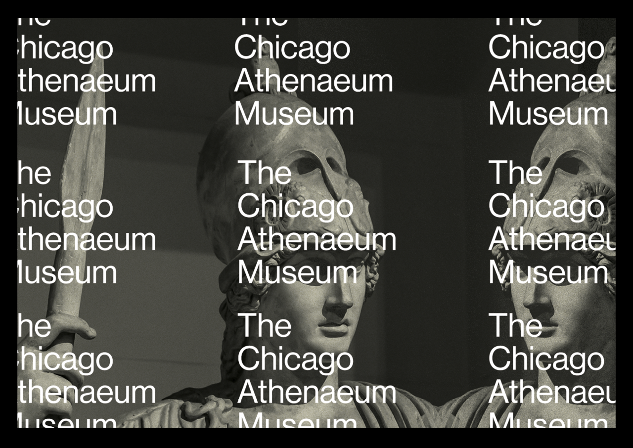
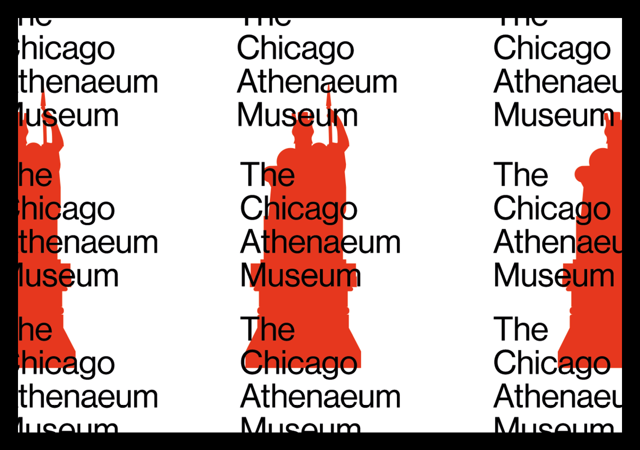
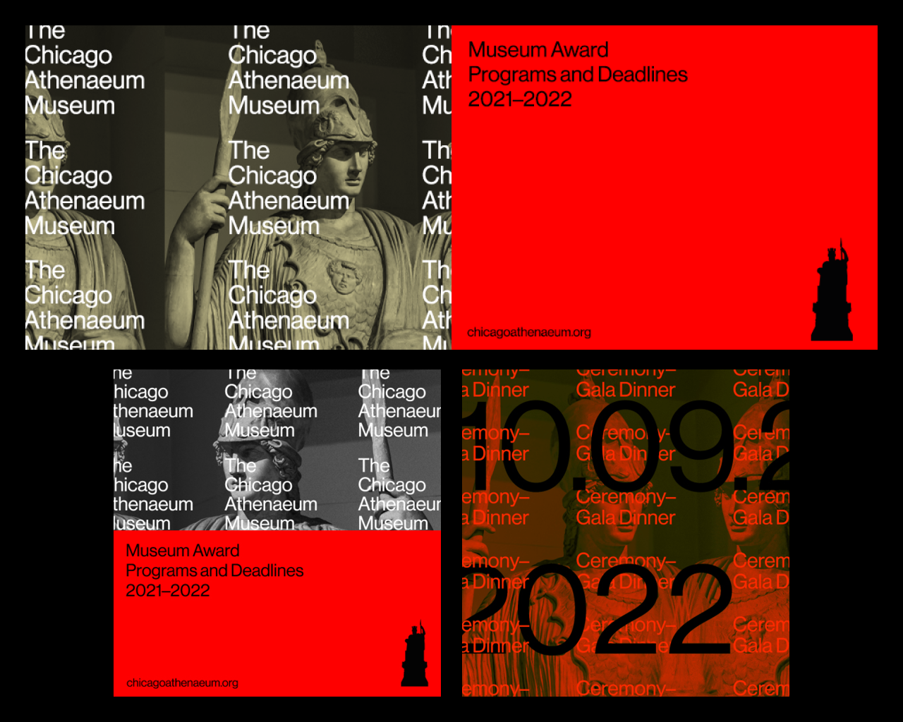
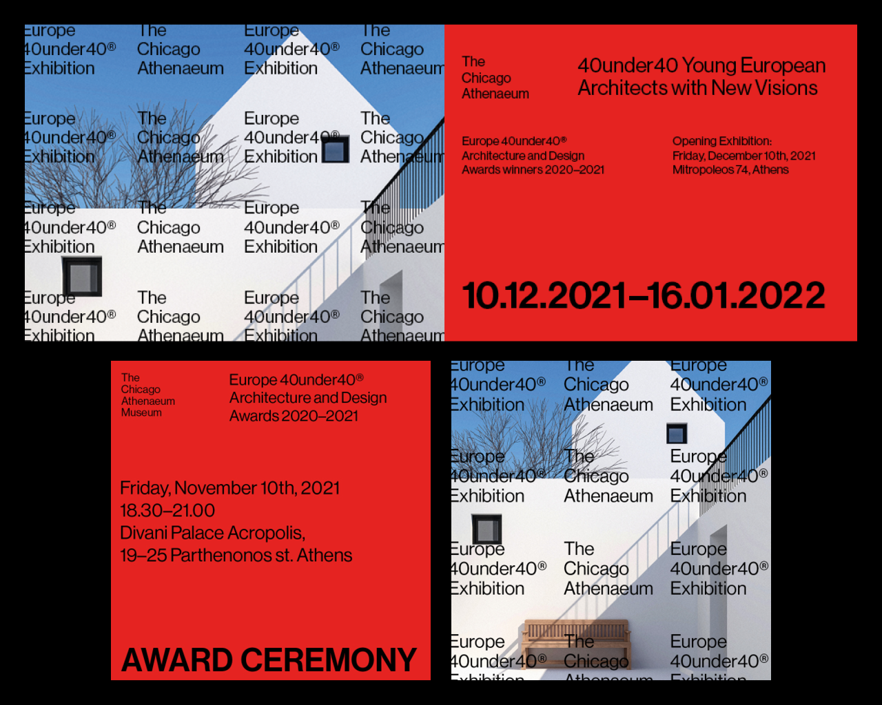
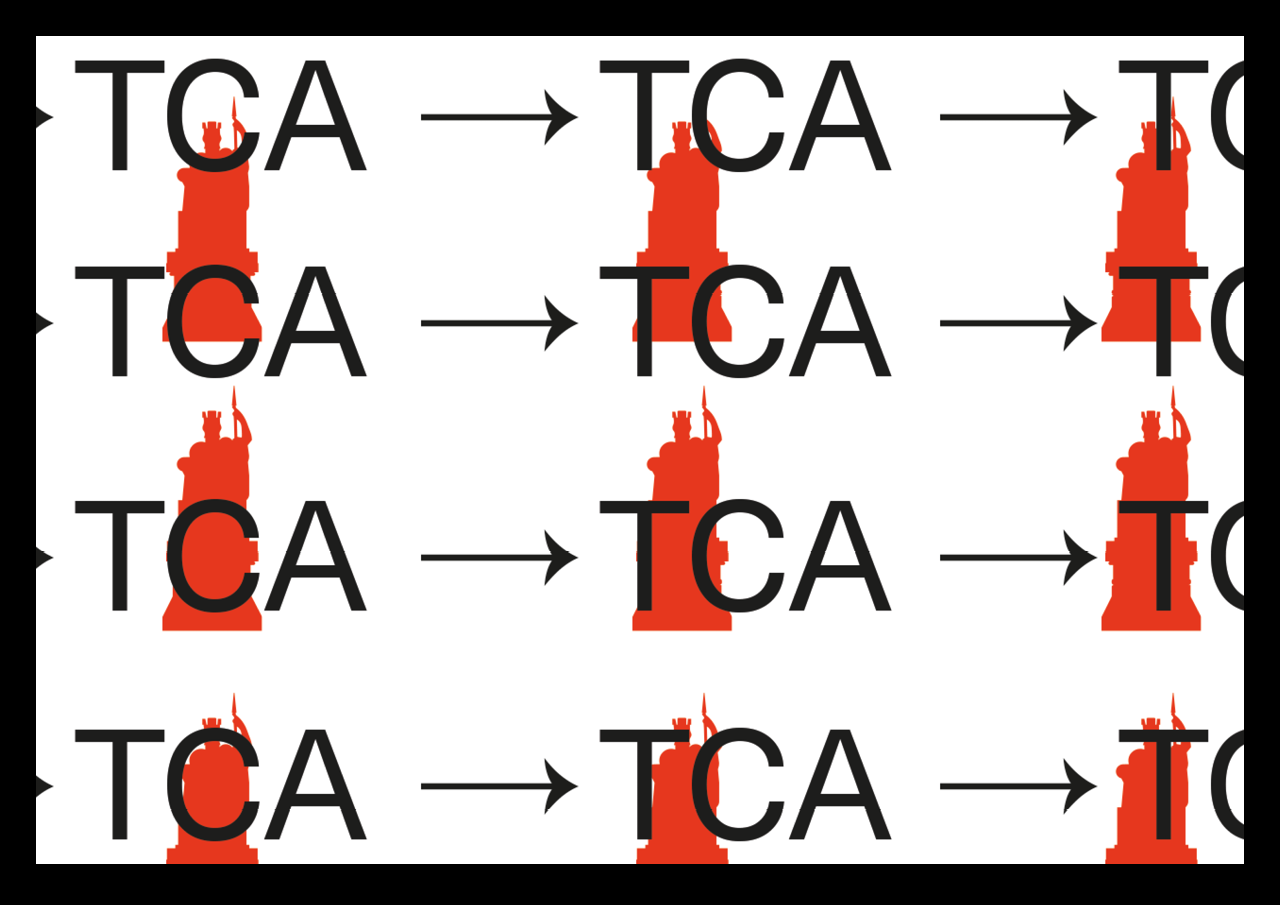
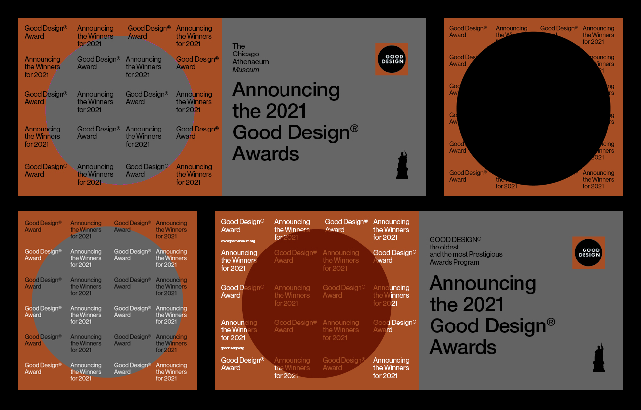
Having already an 8-year collaboration, we had to decode the communication needs through the Museum’s Annual Programs and Events. We considered it ideal to rely on the part of the re-surfacing in a metaphorical sense, knowing full well that the main characteristic of the Museum is the academic dimension faced by each of its programs and the recording of the participants. A grid system was therefore used that either repeats the name of the Museum “The Chicago Athenaeum Museum” or repeats the name of the Award Programe or in any case the “message” in a free combination with the above. The grid system that was defined allowed us to create a space between the typography to either use some photographic material as a background or the stylized statue of Athena (trademark of the Museum) to come as a background and enhance the image of the organization.
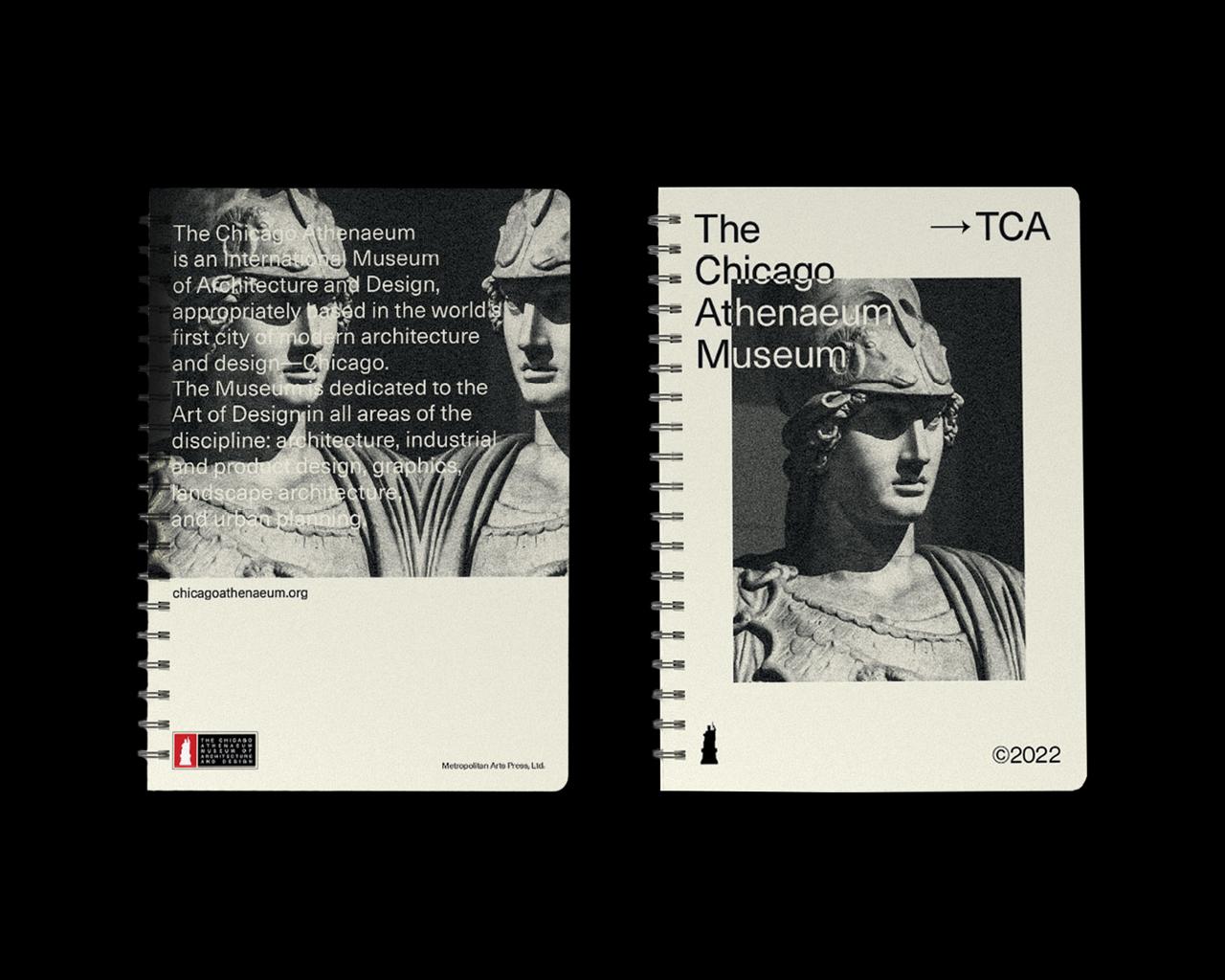
The form of the statue acts as an extension of the visual identity. It is an integral part of it and came from the redesign of the Museum’s logo which also was re-designed by our team. The difference with the existing logo of the Museum was not great. However, the need to simplify the form so that by removing the unnecessary details was decisive for the resulting forms to become basic visual tools for subsequent communication.
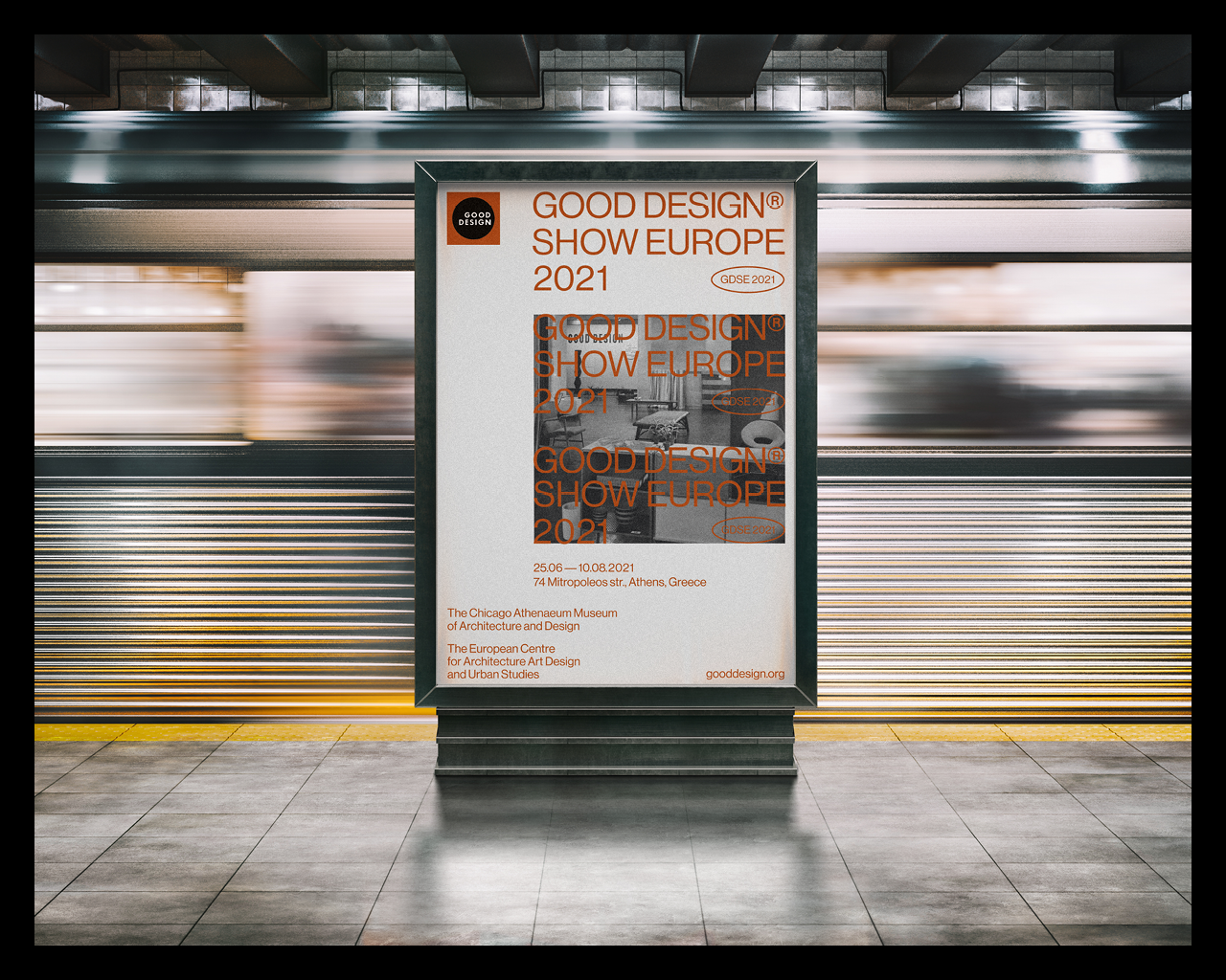
So a basic principle in communication was the goal to repeat as many times as possible the name of the Museum or the prize it organizes, considering that in this way, by repeating it, we secure and at the same time create awareness. No promotional material, no book or poster would lack all the above design characteristics, thus leaving no possibility that anyone who came into contact with announcements or material of the Organization would lose the information.
Our design approach in trying to visually cover an Organization that has been in operation for more than 30 years was to be able to create – design a visual alphabet that can be “open” to new additions. Same as the thought that any Museum should be open in new ideas, new trends or proposals. To be able to change easily without altering the image and the message. To be repeated without being boring or clichéd year after year.
A Grotesk typeface (Neue Haas) was chosen for the typography and our main principle is to primarily use a common font weight across all applications.
–>


Related


